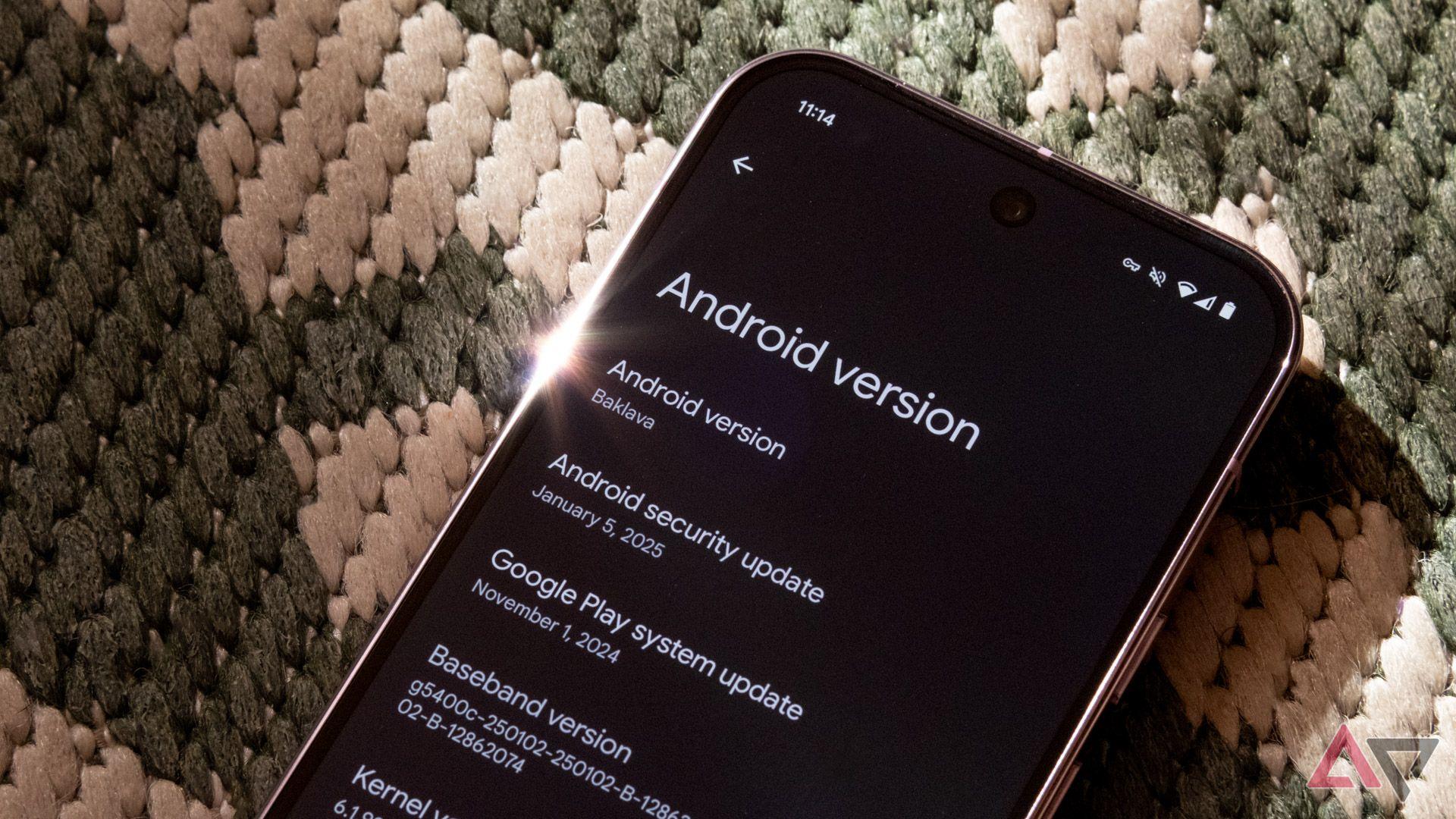
As the tech world eagerly watches each new chapter in the Android saga, Google’s latest release, Android 16, arrives with a curious sense of déjà vu. Rather than a fully formed leap forward, this update feels more like a carefully scripted teaser-an invitation to imagine what’s next, without yet delivering the complete picture. With features that hint at innovation but stop short of revolution, Android 16 leaves users wondering whether they’re experiencing a polished reality or just a preview of the true evolution to come. In this article, we delve into why this release feels less like a definitive upgrade and more like a subtle glimpse behind the curtain.
Google’s Android 16 Unveiled A Glimpse Rather Than a Complete Upgrade
Android 16 arrives not as a sweeping transformation but more like a soft whisper of what the future holds. Rather than rolling out a buffet of game-changing features, Google offers a handful of subtle refinements designed to streamline everyday interactions without overwhelming users with drastic change. These incremental enhancements focus on polishing usability, with updates such as improved privacy toggles, modest UI tweaks, and efficiency improvements under the hood. While innovation feels restrained, this approach provides a stable foundation for developers to build upon, prioritizing consistency over flashiness.
Key highlights include:
- Enhanced battery optimization through smarter background task management
- Refined notification controls for better user customization
- Tighter integration with Google services without added complexity
| Aspect | Android 16 | Expectation |
|---|---|---|
| User Interface | Minor visual tweaks | Major redesign |
| Feature Set | Subtle improvements | Groundbreaking additions |
| Performance | Incremental gains | Significant boost |
Evaluating Key Features That Signal an Early Development Stage
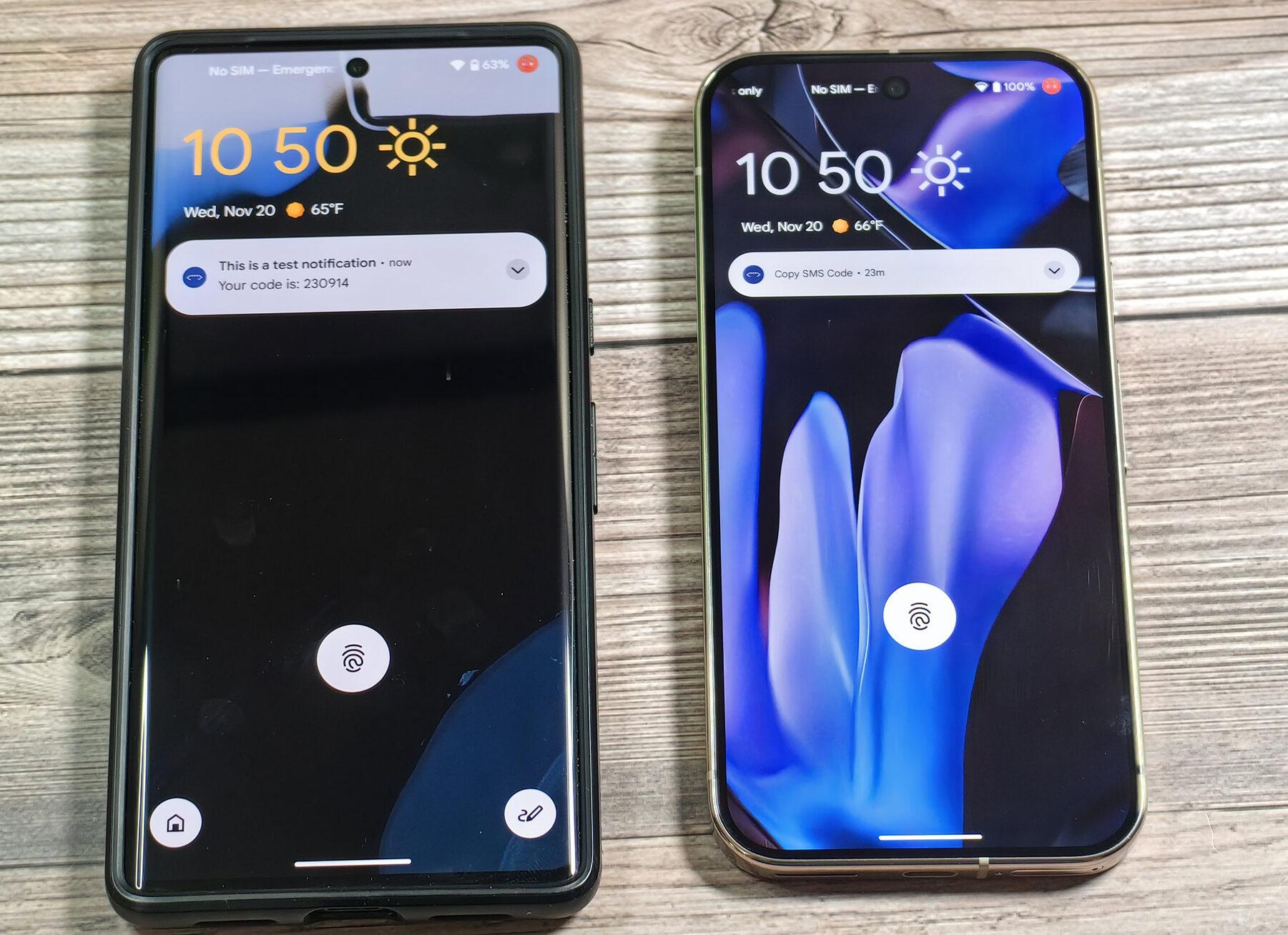
When navigating through Android 16, the unmistakable scent of a work-in-progress pervades the experience. Rather than a polished, user-centric release, it surfaces more as an experimental sandbox. Key features exhibit limited functionality-from basic gestures that lack refinement to UI elements that often feel half-baked or inconsistent. Rather than introducing groundbreaking enhancements, the system leans on subtle, sometimes barely noticeable tweaks, signaling that Google is still iterating on foundational aspects rather than delivering a full-fledged update.
- Inconsistent animations: Transitions sometimes stutter or shift abruptly, breaking immersion.
- Sparse functional changes: New tools and settings appear but lack depth or integration into the overall ecosystem.
- Buggy interface elements: Pop-ups and notifications occasionally misbehave or fail to trigger appropriately.
| Feature | Status | Impact |
|---|---|---|
| New gesture navigation | Partial implementation | Frustrating user experience |
| Settings menu rework | Inconsistent layout | Confusing for users |
| System animations | Choppy and unpolished | Detracts from fluidity |
This early-stage nature isn’t necessarily a flaw but a reflection of Google’s ongoing creative process. It suggests they are prioritizing testing new concepts over delivering immediately usable features. Users can expect Android 16 to evolve significantly, as crucial elements are still being refined behind the scenes. The emphasis remains on capturing feedback and identifying rough edges before committing to a comprehensive, stable user experience.
User Experience Challenges and How They Might Be Addressed
One of the most glaring user experience hurdles with Android 16 lies in its inconsistent interface polish. The release intermittently feels more like a developer’s beta than a consumer-ready update, leaving users grappling with unexpected bugs and unfinished features. This fractured experience diminishes confidence and can frustrate even the most patient adopters. Addressing this requires a sharper focus on stability and thorough quality checks before rollouts, prioritizing smoothness and cohesion over feature quantity. Clear communication regarding what’s experimental versus finalized would also help manage expectations effectively.
Another challenge is the overwhelming array of customization options that, rather than enhancing usability, often create a sense of decision fatigue. Many users appreciate simplicity and intuitive defaults. A possible solution could involve incorporating adaptive UI elements that intelligently suggest settings based on user behavior, paired with a visually streamlined interface layout. Consider this quick comparison table illustrating a potential approach:
| Current Experience | Proposed Solution |
|---|---|
| Multiple manual toggles for similar functions |
Context-aware suggestions with unified control hub |
| Fragmented UI patterns across apps | Consistent design language with seamless transitions |
| Frequent unexpected crashes | Prioritized stability with phased feature releases |
Recommendations for Navigating Android 16 in Its Current Form
Key Takeaways
As the dust settles on the Android 16 unveiling, it’s clear this release feels more like a whispered hint than a full-throated announcement. Google has laid down the bones, but the flesh still seems to be in the workshop. For enthusiasts and everyday users alike, Android 16 offers a tantalizing glimpse of what’s to come-an early draft rather than the final masterpiece. Whether this preview will evolve into a transformative experience or remain a stepping stone is a story yet to be told. Until then, we watch patiently, knowing the real Android journey is still unfolding just beyond the horizon.

